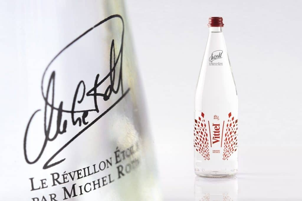
The Christmas holidays are approaching – and along with them, their entourage of limited edition packaging. Every year in fact, brands stretch their imagination to offer enthusiastic consumers a new collection of event-driven packaging. As a business bet for brands, year-end packaging falls under the “favorite purchase” category for consumers who are willing to allow more spending for pleasure during the holidays. The latter thus allow themselves to be seduced by the aesthetics of packaging that transcends its functional dimension to become a decorative object.
Of course, the products traditionally eaten at Christmas and the New Year are the most affected (pralines and spirits are chief among them) but more and more brands, from all markets, are rushing into this festive breach. And some even take advantage of the chance to innovate in terms of products, devising new and more elaborate formulas that fit well with the culinary craze of end-of-the-year festivities.
Brand-new containers, a play of materials, elegant decoration… the Limited Edition is of course an exercise in style, where creativity plays a major role, but it is not limited to this. Because above and beyond the graphic trend, brands tend to consider their event-driven packaging as a genuine support of their positioning, thus reaffirming their leadership.
When packaging dresses itself in luminous attire
The basic contract of a year-end limited edition is of course in the respect of stylistic specifications directly inspired by traditional Christmas imagery: snowflakes and reindeer, fir trees and ornaments, ribbon and other gold accents, etc … many brands thus dress their packaging with a lovely decor in tune with the season. It’s one way to animate the brand and supermarket shelves, as well as generate an impulse purchase, which will inevitably have a beneficial effect on short-term sales.
Other brands go even further and create, for the occasion, collector sets that consumers acclaim for the originality of their design and voluntarily offer as gifts. The design of the shape and volume is thus essential, like a true gem – it almost more important than the product it contains.
But the aesthetic issue should not leave out the importance of respect for the personality and identity of the brand. As a design agency we always advocate a ‘branded’ approach to the limited edition. For it is by capitalizing on their graphic DNA, by playing with those codes, that brands can then strengthen their power and uniqueness.
Enriching the graphic alphabet
On exceptional occasions, design breaks the mold. When launching a year-end limited edition, brands are more willing to dare, and do not hesitate to cultivate their projection territory. The year-end packaging is then not only there to serve a festive occasion, but it also allows the brand, for example, to reveal a little-known aspect of itself or to reach a new target audience that it aims to recruit. The event-driven design is a way for the brand to tell a new story, without ever denying its identity. In so doing it enhances its graphic language of codes that renew the appeal of the brand in the eyes of consumers, and that are sometimes re-used from one year to the next, to create consistency.
Designed to be ephemeral, these festive codes can then become part of the brand identity. The most emblematic case of this is Evian, with its successively shaped bottles in the form of a montage, water droplet, and the latest generation of the Christmas bottle in a streamlined design, all signed each year by a different designer.
Year-end limited editions show once more that packaging is a preferred support for the embodiment of the brand platform. An image wager as much as much a business bet, they are becoming more and more a part of a global brand strategy. To combine the attractiveness of festive codes with the affirmation of a brand vision: this is now the challenge for event-driven packaging.
Sarah Zannetti, Strategic Planner

