We are increasingly solicited in our daily lives, with extra-targeted advertising, untimely notifications and social network over-connection. The proof of this overload? Our average attention span dropped from 12 to 8 seconds between 2000 and 2020 – that’s 1 second less than a goldfish!
In recent years, the word “sleek” has become one of those magic words that promise brands to effectively reconnect with an over-solicited consumer. But… what is exactly this notion?
If we take its definition, sleek is a simplified representation of a message or object, capable of expressing its essence in a minimum of elements.
But sleek doesn’t just mean minimalist. In fact, the same object can be “simplified” in different ways, for different results and objectives. The same applies to packaging.
The sleekness of packaging is often considered to be primarily an aesthetic issue. But it’s also a strategic issue, enabling tactical choices and brand strategies to be taken directly to the shelf.
Here are 3 ways in which sleek lines can improve the impact of packaging on the shelf.
I – CLARIFYING THE STRUCTURE OF THE OFFER
By simplifying codes and messages, brands can clarify their product propositions and guide consumers through the offer. The main enemy for these packagings: the trend towards excess RTB, which creates facings drowned in information where nothing can emerge.
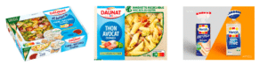
Daunat salads have long been a victim of this kind of practice, with at its peak a dozen claims for the consumer to decipher on the facing. Daunat has therefore simplified and re-hierarchized its product information. The result is a clear facing that enhances the value of the product and its ingredients.
Harrys has taken a similar approach with its 100% Mie, opting to lighten up its packaging by swapping its blue flat panel for a simpler transparent pack, allowing the product to embody directly its promise. Not only does the product stand out more, but the brand itself has gained in impact.
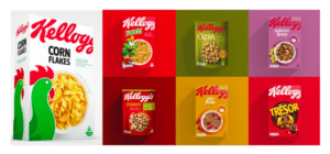
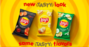
In terms of branding architecture, brands such as Kellogg’s or Lay’s have been able to smooth out their codes to simplify navigation through their offer, while at the same time enhancing the value of their brand. Gone are the different codes for each brand, in favor of a single message and structure that enhance the brand as much as its products, and create a unique range effect on the shelf.
II – CREATE POWERFUL BRAND STORYTELLING
Simplifying packaging design also enables us to enhance our storytelling and brand universe, moving from a product promise to a brand promise.
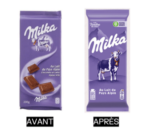
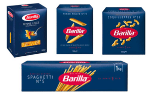
Brands such as Milka and Barilla have streamlined their packaging to refocus on the brand. The product becomes one with the identity, or even disappears in the case of Milka, leaving the brand and its brand assets to proudly carry the product promise.
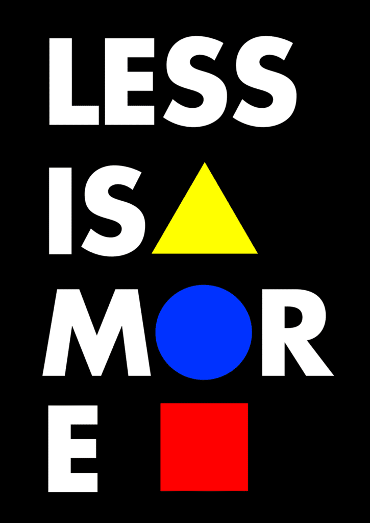
The same goes for the Less Is More brand, whose philosophy is centered on the idea of “The importance of the essentials” bringing together the needs of individuals and the demands of the world.

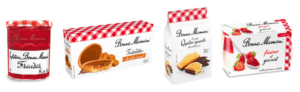
Opting for a streamlined design around brand assets also reinforces the brand’s impact when it changes category. Bonne Maman, for example, has leveraged its on-pack brand assets (the gingham, the Bonne Maman handwritten typeface) to effectively perpetuate the “simple and at-home” message in different departments, without having to resort to daughter brands.
III – ICONIZE THE BRAND
Uncluttered packaging design can also transform well-established brand assets into veritable icons marking out their shelves. These icons carry almost the entire on-pack message, and act as a link with the communication.
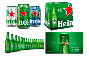
The Heineken star can then become THE ICON for the consumer, taking precedence over the brand name. It can also be customized for limited editions, while retaining its evocative power.
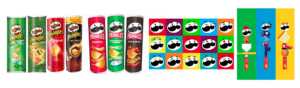
The redesign of Pringles packaging also makes use of purity to iconize the brand around its assets. The mascot becomes minimalist, changing posture and expression in both packaging and communications, while the recipe visuals reinterpret the iconic stacking of potato chips in each tube.
Sleek design is therefore not just an aesthetic choice, but a real branding lever, in a context where consumers need to be seduced at first glance. From product promise to brand promise, sleek design is a highly flexible and effective tool, capable of adapting to your brand strategy and the level of recognition of your brand and its codes.
Here are a few principles to follow for a successful packaging layout:
- Prioritize information, to make the packaging easy to read.
- Make choices about which information to highlight. Consumers have little time to devote to us, so we need to concentrate on one main message.
- Ensure consistency of form and content, so as not to dilute the message.
But to go further in its packaging purification, it is above all necessary to rely on brand assets – brand codes transformed to become unique, proprietary, meaningful and activable. But you need to know how to detect them, simplify them and install them effectively and sustainably.
Would you like to make the transition to lean packaging?
Contact us for advice from the Logic Design team.