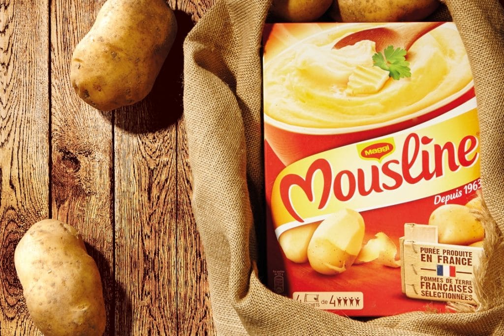
The iconic Mousline brand has undergone a revamp to boost its appeal. Logic Design has completely redesigned its branding and package architecture to enhance the uniqueness of its offer.
Despite holding over 70% market share and its historical leading position in the market, Mousline had been observing a decrease in its appeal. Notably, in an era where the search for naturalness has become increasingly present. After holding a competition, the brand entrusted Logic Design with an overhaul of its branding and package architecture with the aim of proudly claiming its origins and expertise.
To achieve this, the agency has implemented its proprietary methodology; “Open pilot” that allows to co-build identity redesigning along with consumers. The bias of this repositioning is to affirm the uniqueness of the Mousline recipe and enhance its manufacturing process, related of course to an industrial process, but very close to homemade mashed potatoes. The agency has designed a new scope of expression through a fluid narration between the brand and its product. All the elements of branding and packaging satisfy and enrich one another to create a both aspirational and impacting storytelling concept.
The main ingredient, potatoes (99%) has now become the common thread of Mousline’s branding and is also suggested in the logo. Mousline has adopted a palette of more natural tones of brown and beige. The typography of the logo has been redesigned to create greater consumer proximity with its large heart-shaped M and cursive writing. The package architecture is entirely intended to serve the storytelling of Mousline’s product approach.
While retaining its heritage dimension, this redesigning allows the brand to renew itself through a domain which showcases the manufacturing and origin of its ingredients. Mousline has reattributed acclaim to an everyday and historical product.