Top14
Embody the excellence of the French rugby league
EXPLORING
Meetings with all the stakeholders
The agency took a deep dive into rugby culture, the people who play it and the fans who like to watch it. The team wanted the total rugby experience: going to matches, meeting players, understanding their universe, meeting fans, talking about their relationship to the brand, meeting sponsors and understanding their needs and their attachment to the league.
The teams got to understand the expectations and challenges facing the stakeholders. The feedback was unanimous, the codes and values surrounding rugby were what counted for fans and players: excellence, power, and the will to cross the line and score a try!
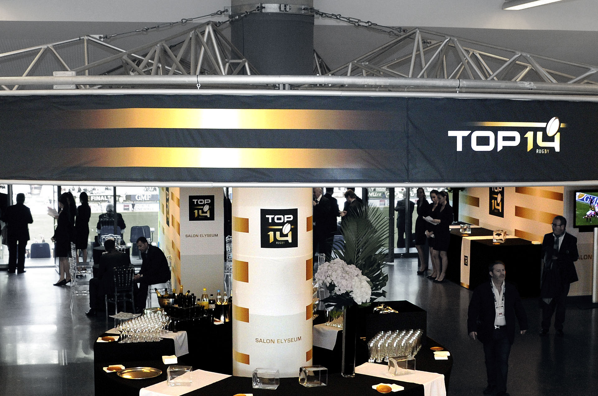
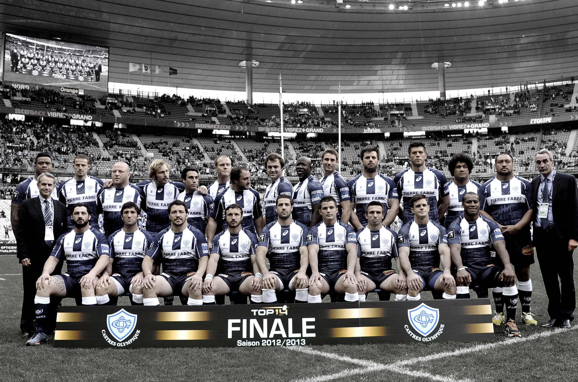
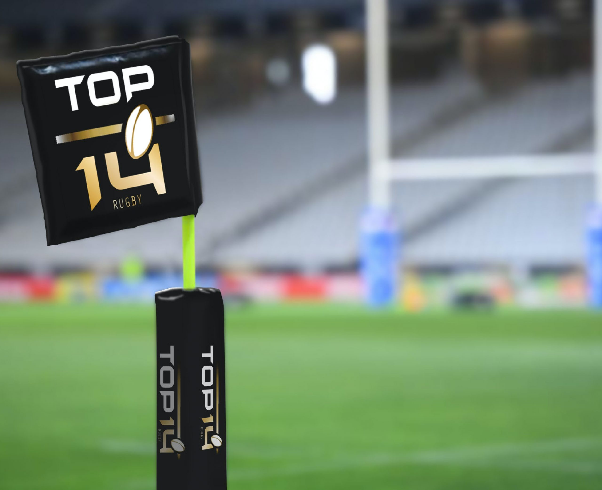
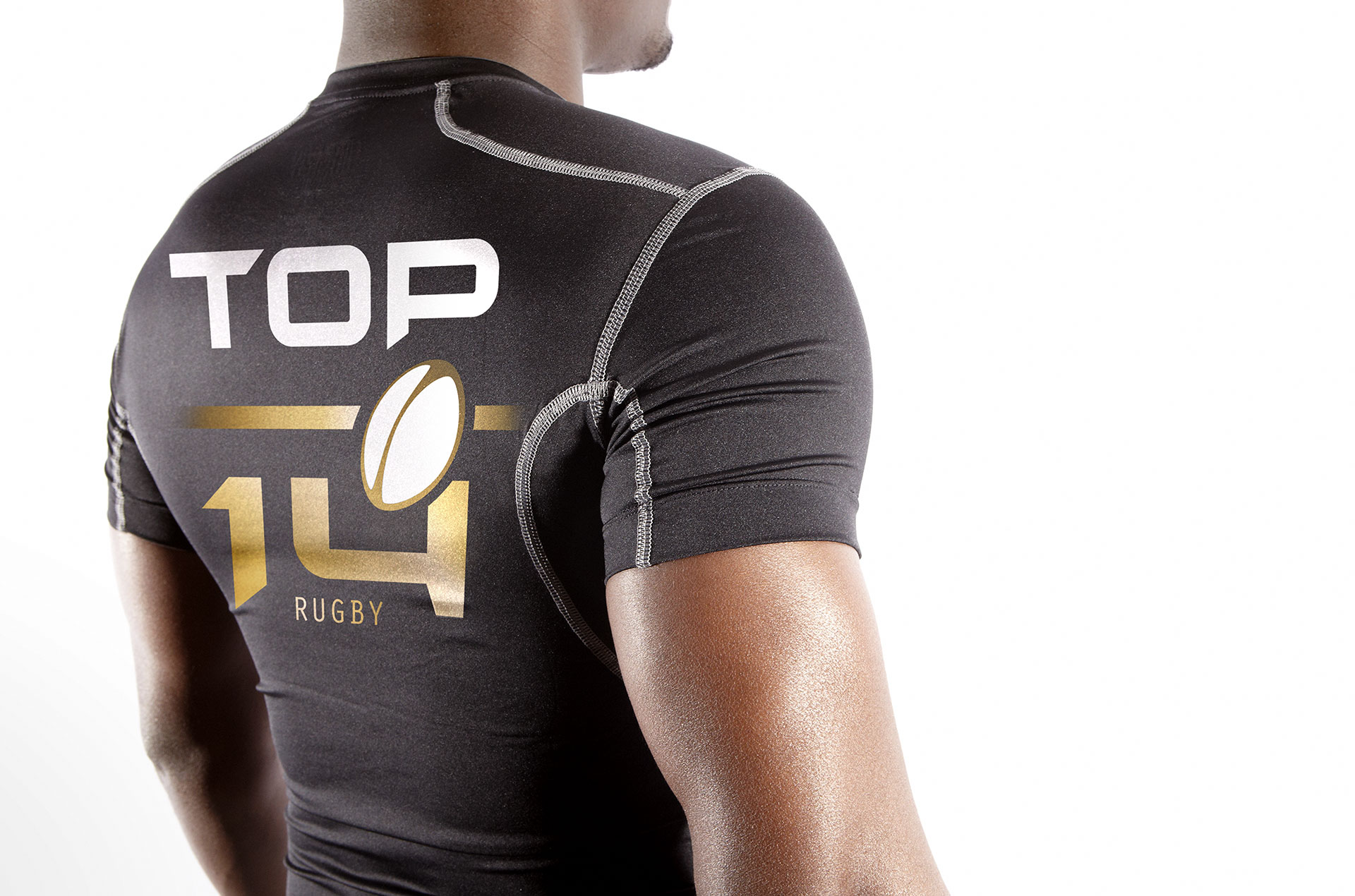
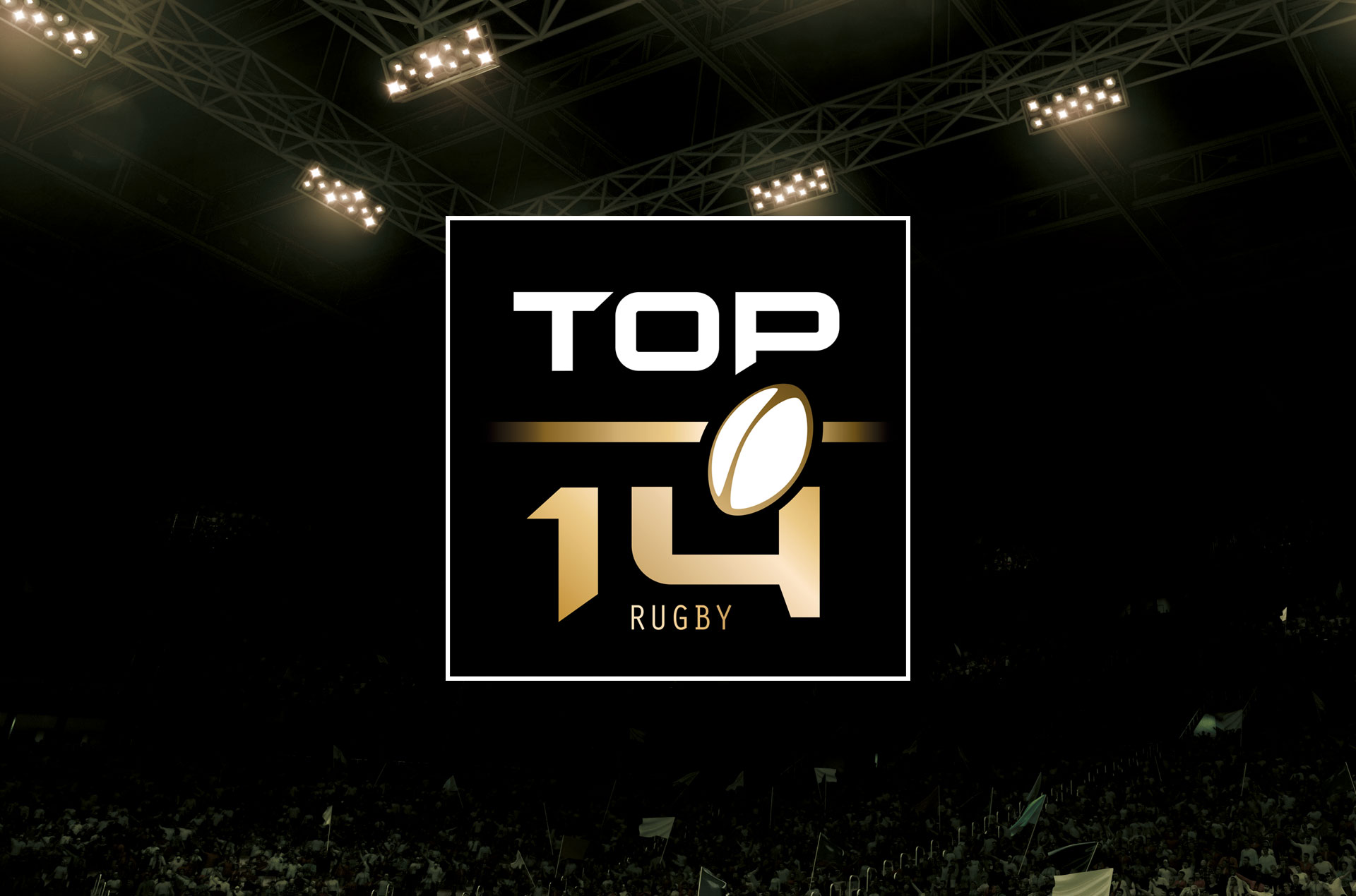
From the ball to the complete branding of stadiums, via media supports and non-media Logic Design designed the entire brand universe.
More than 8 years after this identity was launched it remains an icon and a proud banner for the players of the league!




« The french rugby league has an identity that matches what’s at stake. »
Thibault CHATELARD
Marketing Director
Ligue Nationale de Rugby

